Laurel
Rebranding
Laurel is one of the largest groups of funeral directors in the UK, operating over 60 branches.
The funeral industry had typically not invested in branding, but as a professional management business integrated into the funeral sector, Laurel understood that a strong brand could help leverage more value for the business. Following substantial private equity investment, the management team asked us to review their offer and rethink their identity.
With the name having such redolent image associations, our research soon led us to explore the meaning and symbolism of the laurel tree. We discovered that not only was it a sign of olympian accomplishment but it was also associated with knowledge, peace and growth – all positive connotations that resonated with the directors.
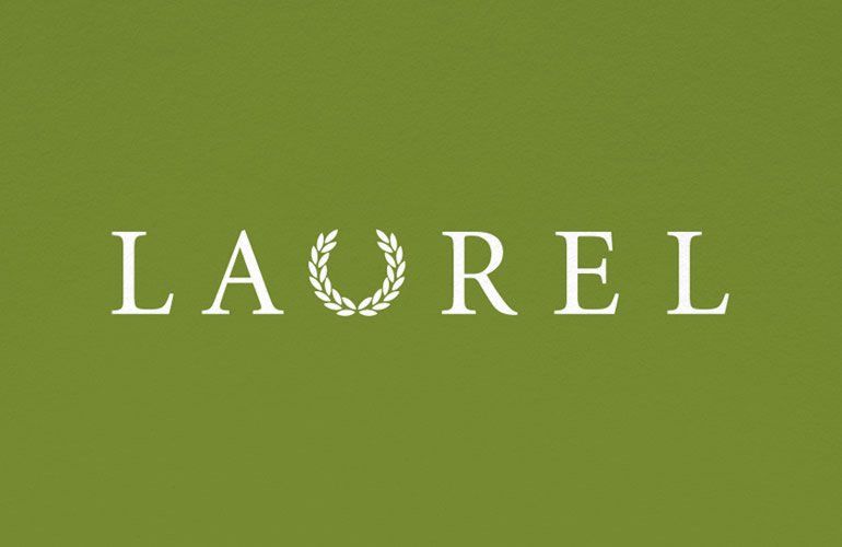
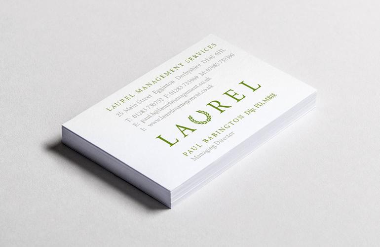
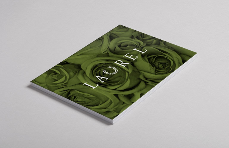
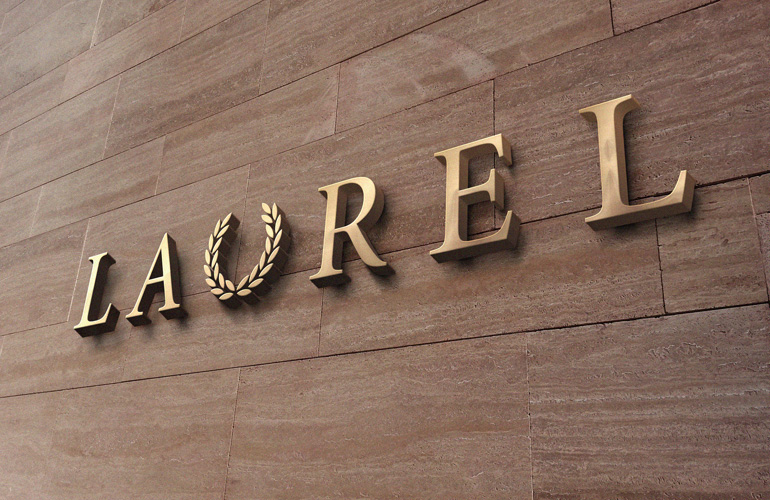
The design needed to convey the capability of the business whilst respecting the names, traditions and heritages associated with individual sites, many of which have been serving their communities for several generations. Our solution was to simply replace the “U” in the name with a graphic laurel wreath. Classic typography, evocative photography and an elegant colour palette all contributed to an elegant identity that successfully positioned the business as being trustworthy and reputable.
Within five years of the rebrand, the business was sold realising a 3.4x yield for the owners.
What we did
Brand strategy / Brand identity / Brand communications: Website / Presentation design / Brochures / Signage / Art direction
Laurel

“The work you did for us had just the right balance of modernity and heritage. We’re delighted with the results.”
John Makepeace – Managing Director